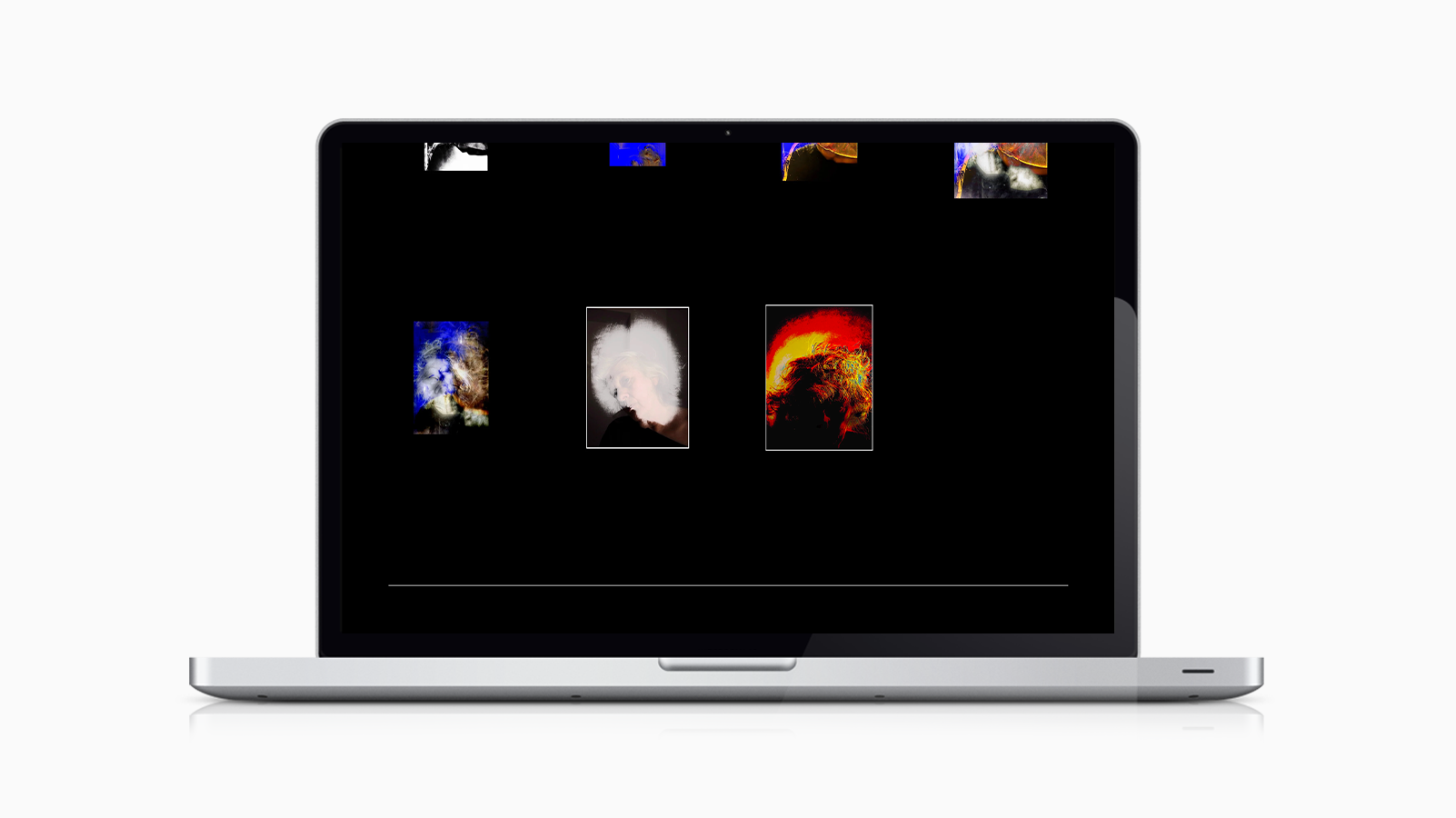
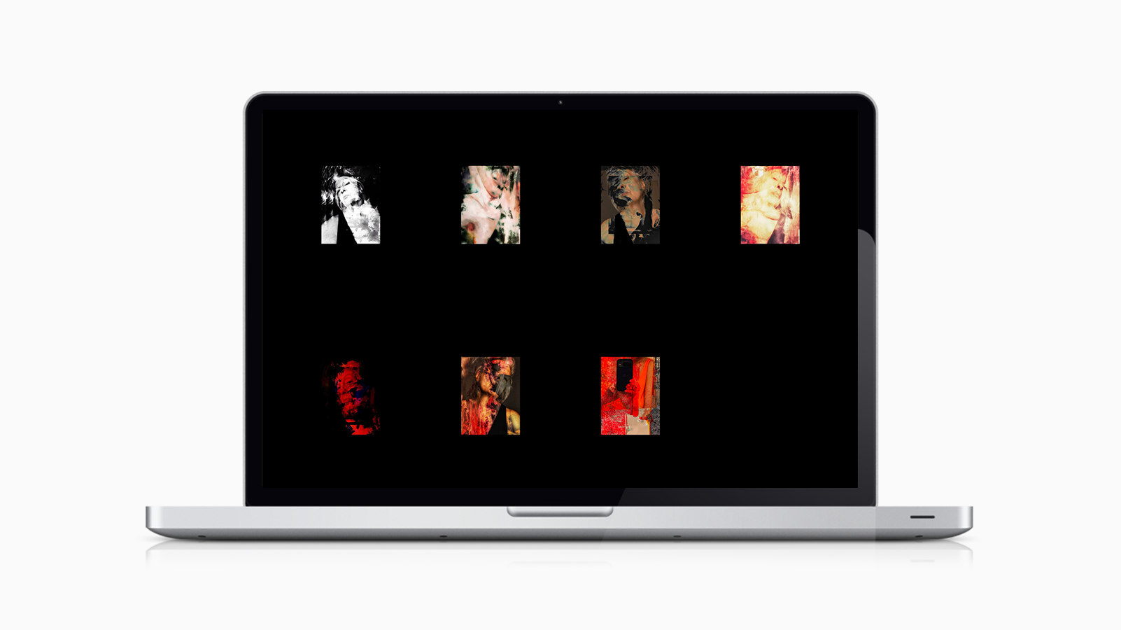
Sublu
A digital identity and platform for an alternative camera artist.
INTRO
SuBlu is an alternative camera artist whose work explores perception and the shifting nature of self through smartphone image-making.
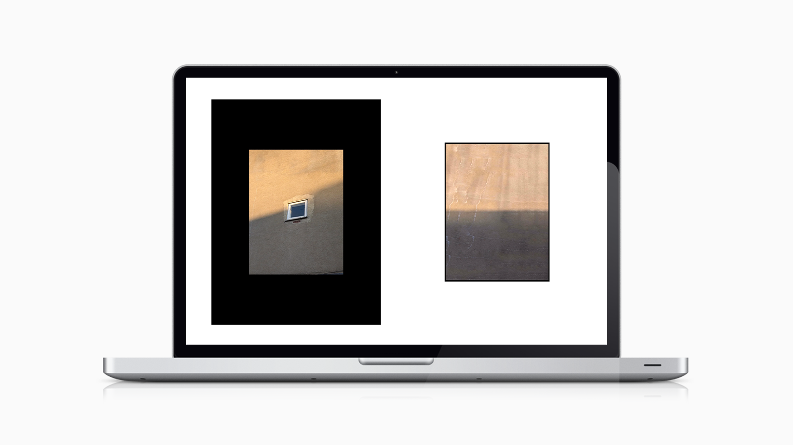
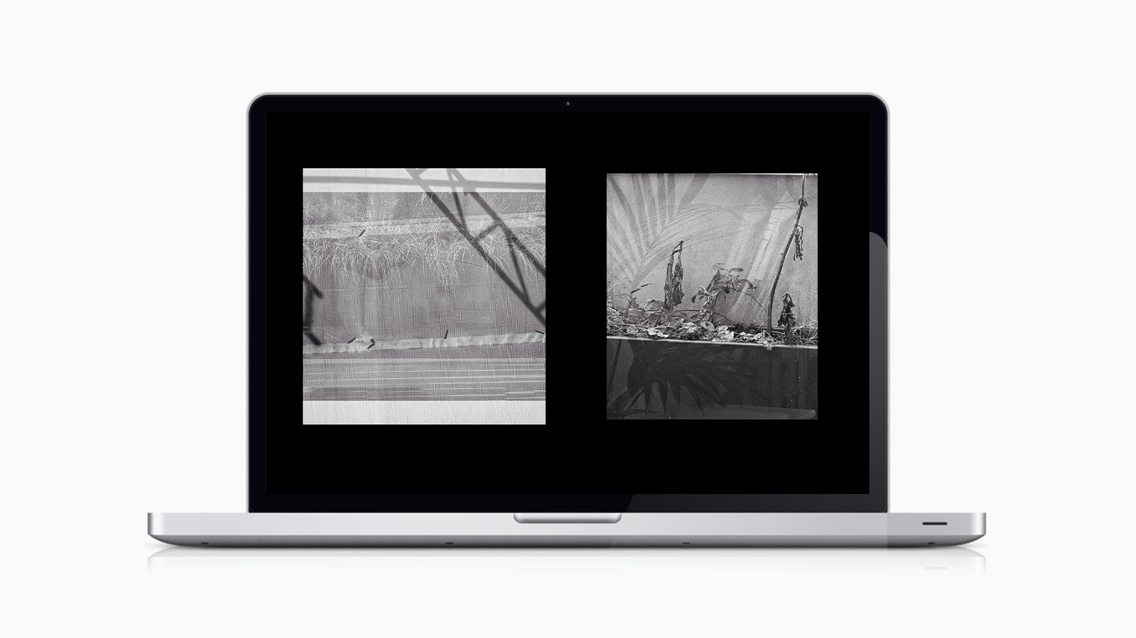
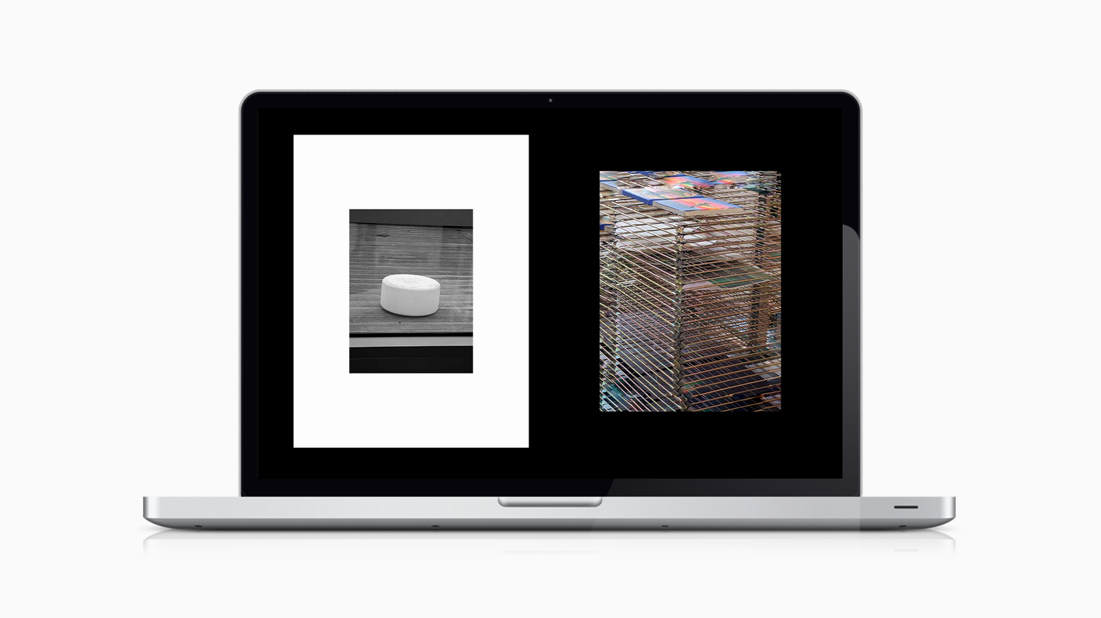
Working exclusively on a Google Pixel, her practice rejects traditional photographic standards in favour of something more immediate and instinctive. The project focused on defining how this body of work should exist digitally - not just how it looks, but how it is structured, navigated, and understood.
CHALLENGE
The work existed as a large, unstructured archive with no clear system for navigation, hierarchy, or presentation, and no identity to frame the practice.
In its existing state, the archive relied entirely on viewer patience. There was no clear entry point, no guidance through the work, and no sense of progression.
The challenge was to introduce structure without neutralising the work - creating clarity and direction while preserving its raw, open-ended nature.
APPROACH
The project was approached as a combination of brand design, content strategy, and experience design.
Rather than applying a conventional portfolio model, the aim was to develop a system aligned with the work itself - minimal, flexible, and quietly structured.
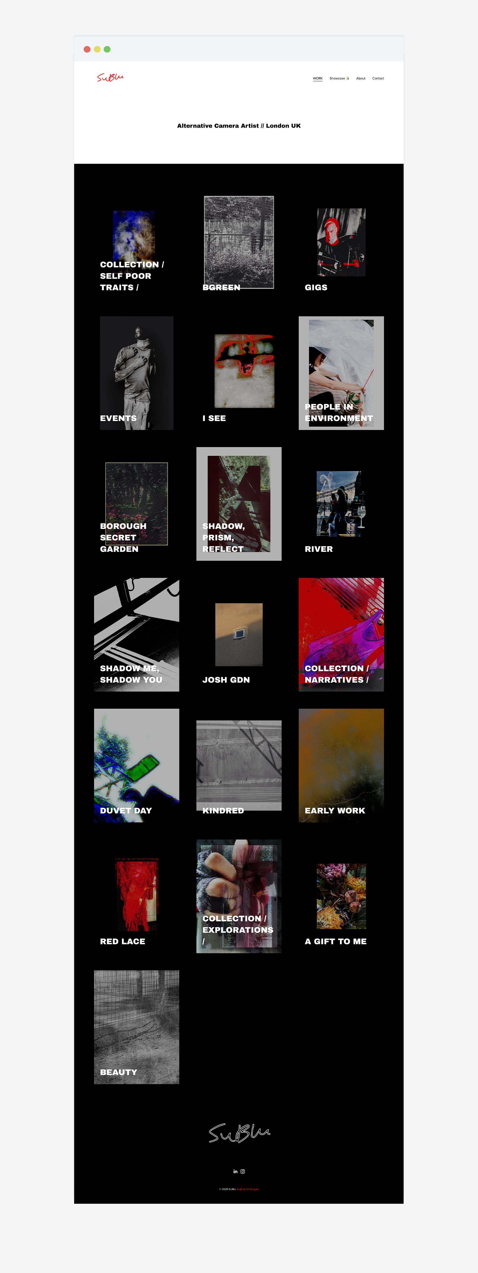
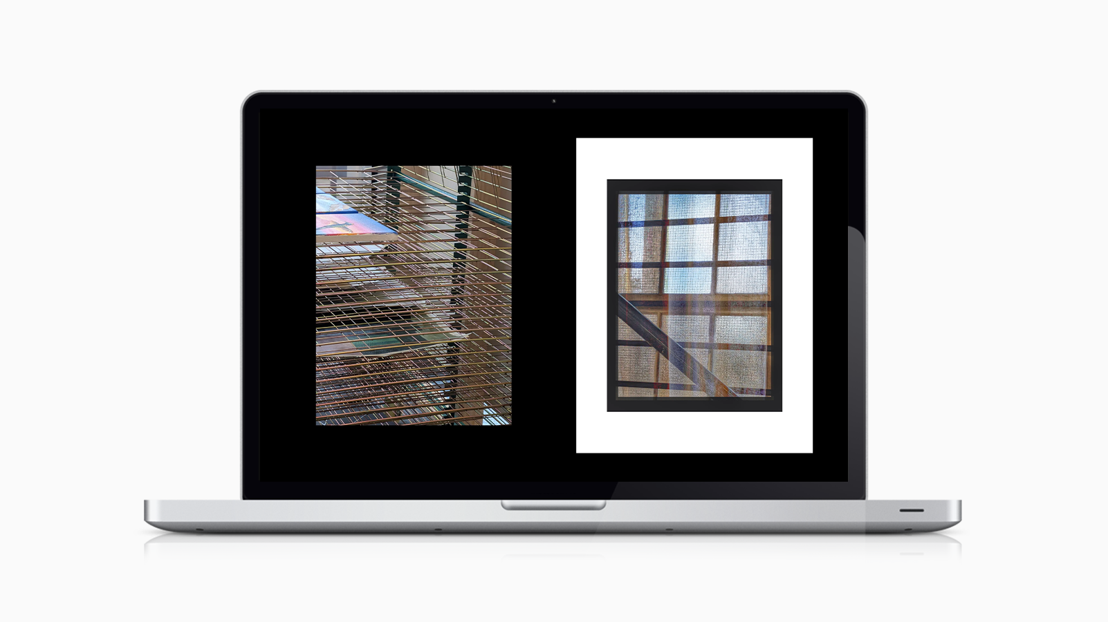
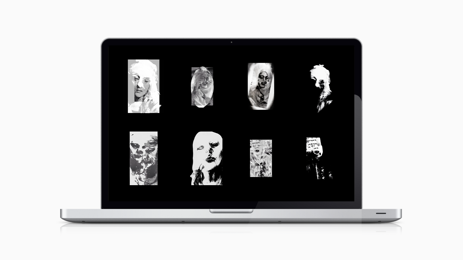
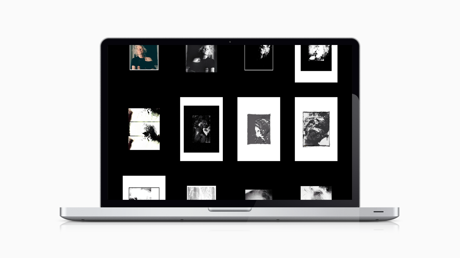
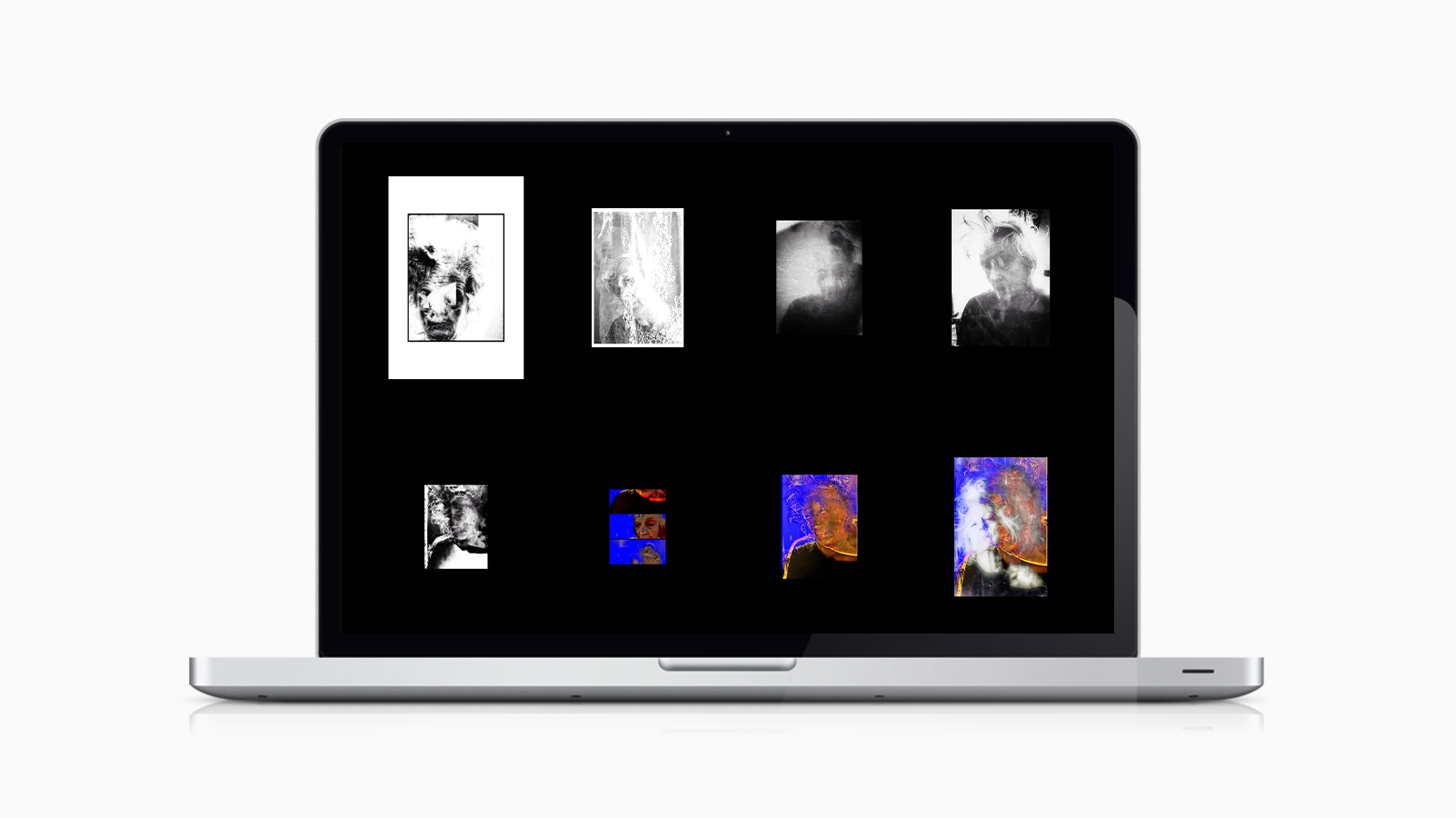
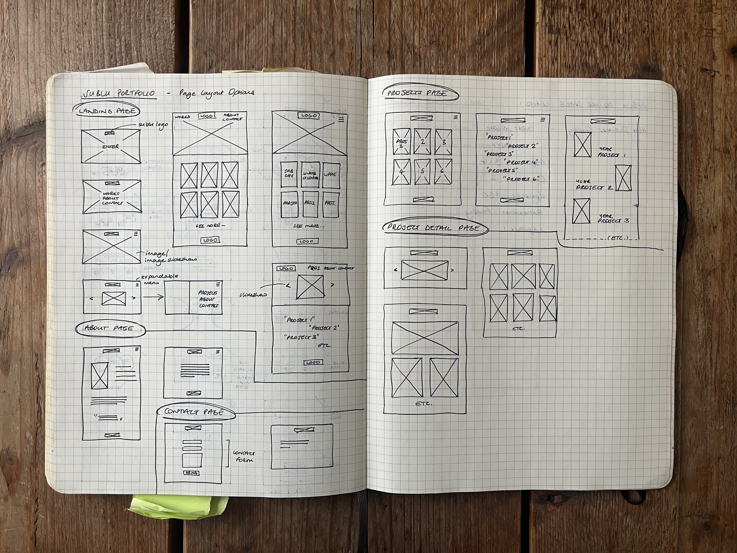
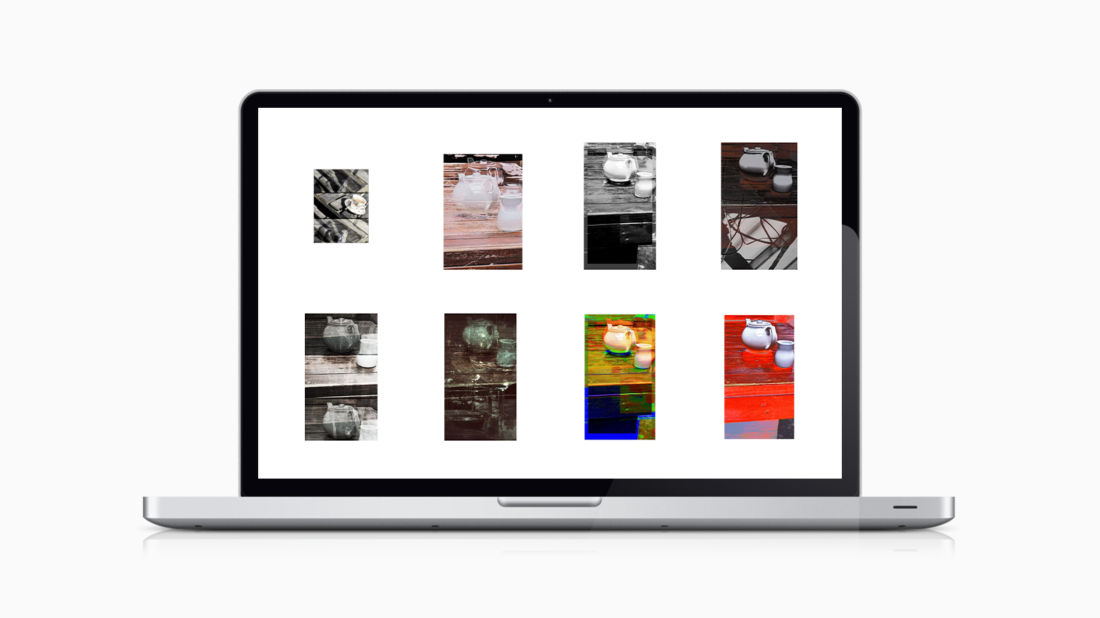
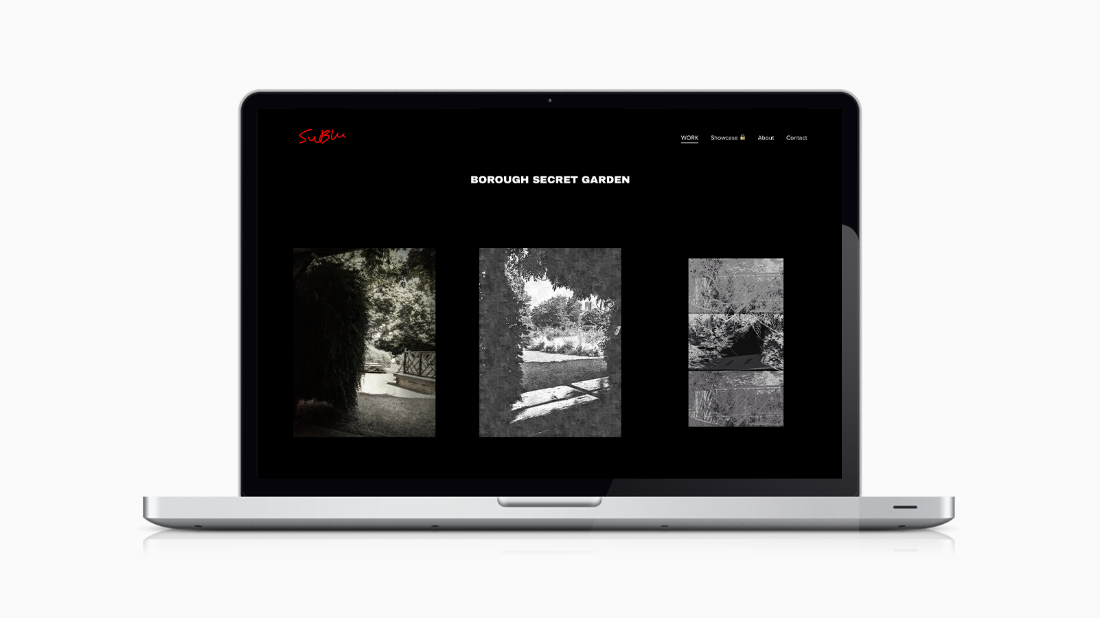
Content was edited and organised into distinct collections, shifting the archive from a volume of images into a set of intentional bodies of work. The experience was designed to reduce friction while subtly guiding attention, allowing users to move through the work in a way that feels self-directed, but not accidental.
EXECUTION
A restrained identity system was developed to support the work without competing with it.
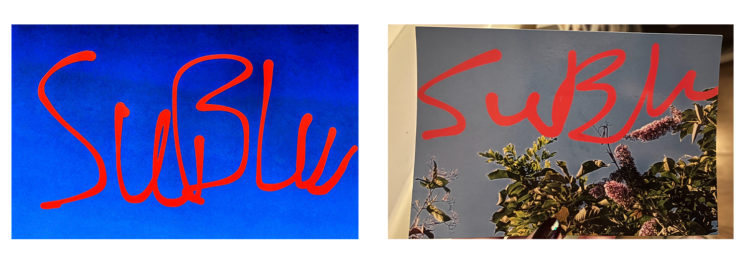
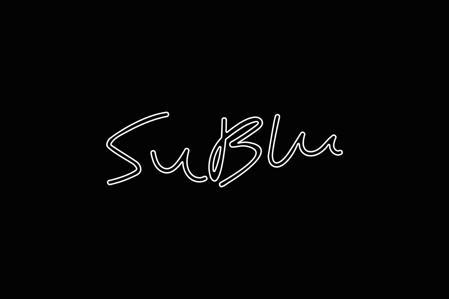
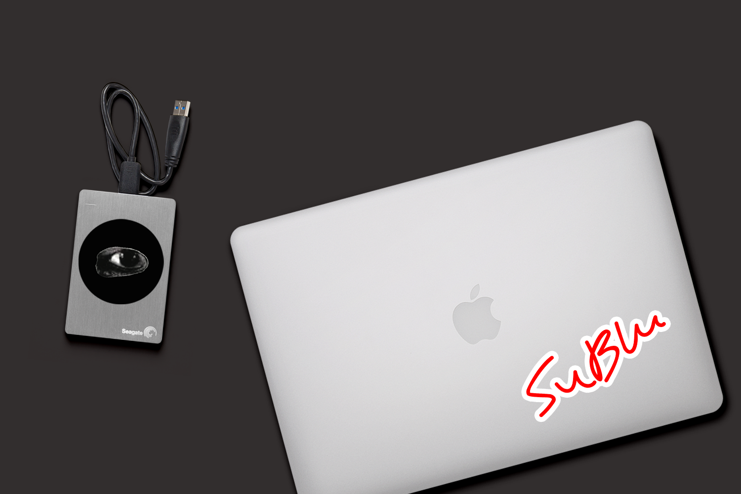
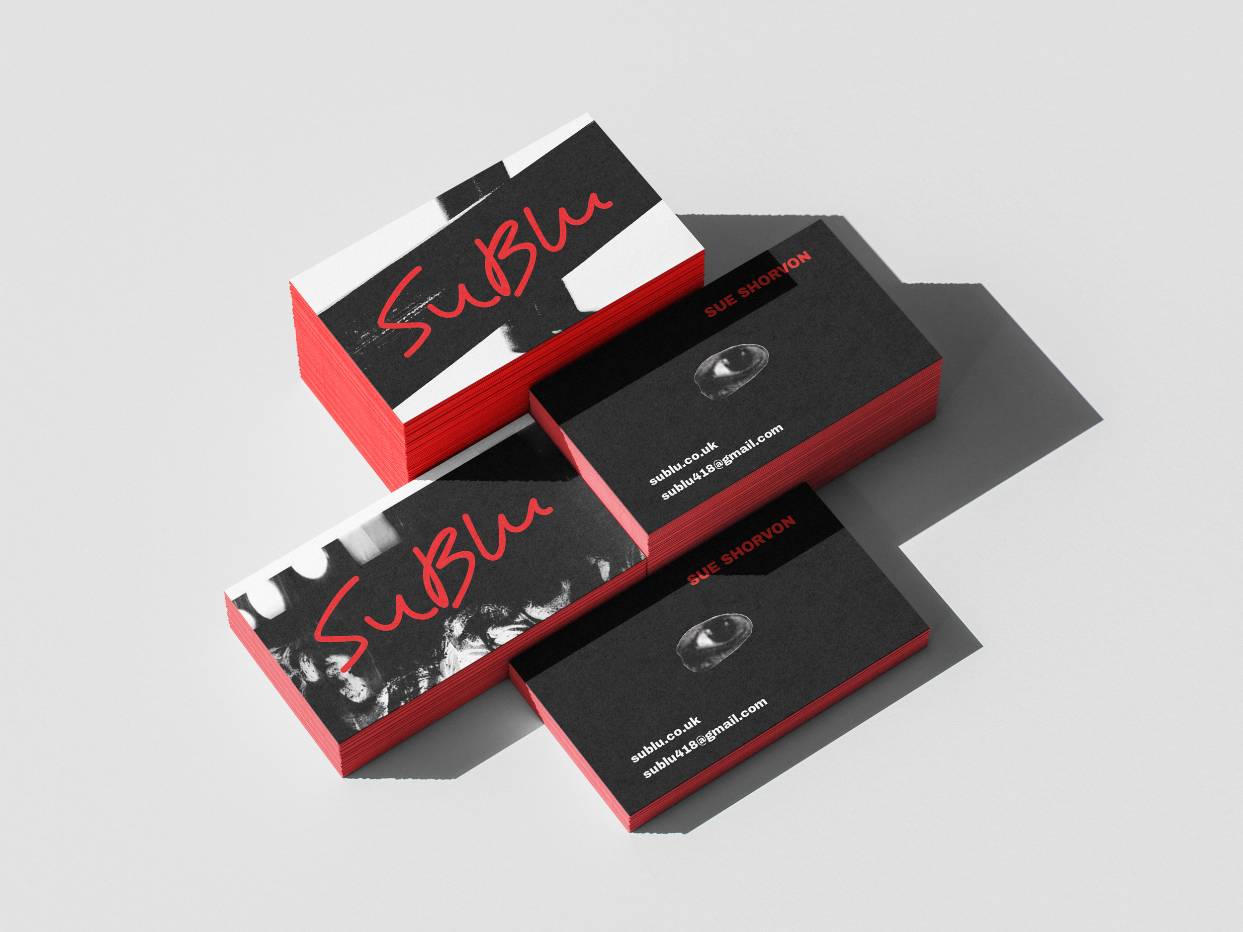
The logo was refined from SuBlu’s original sketches below, preserving its imperfections while improving balance and usability. Instead of over-polishing it, the goal was to retain a sense of authorship - something that still feels owned by the artist, rather than designed for them. A secondary eye motif, taken directly from the artwork, was introduced as a recurring element to reinforce recognition.

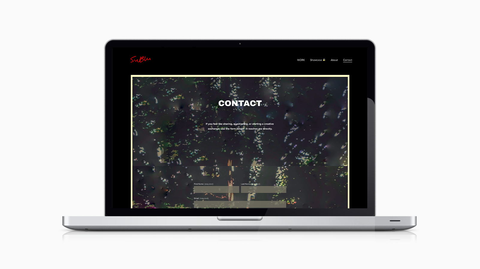
The digital platform, built in Squarespace, functions as both portfolio and evolving digital exhibition space. The structure introduces controlled entry points and clearly defined collections, allowing the work to unfold gradually rather than overwhelming the viewer.
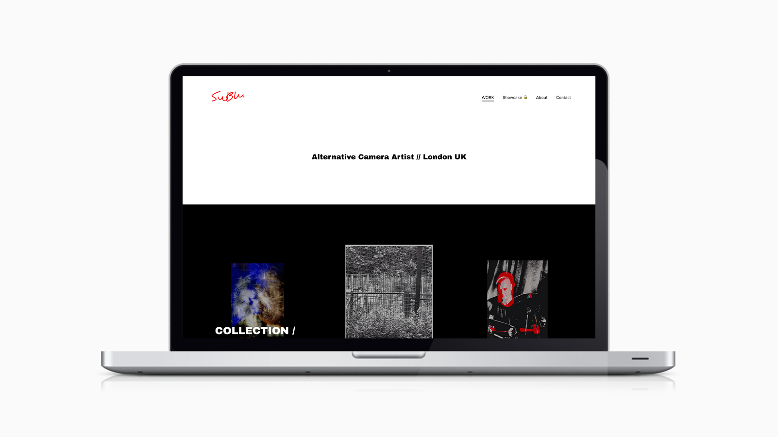
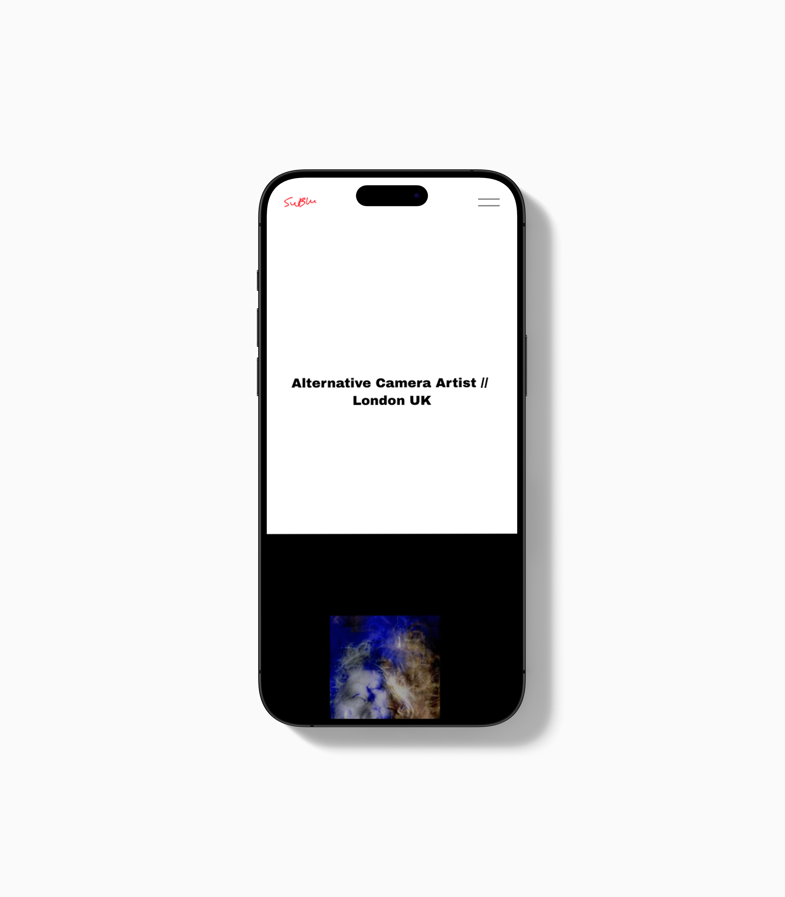
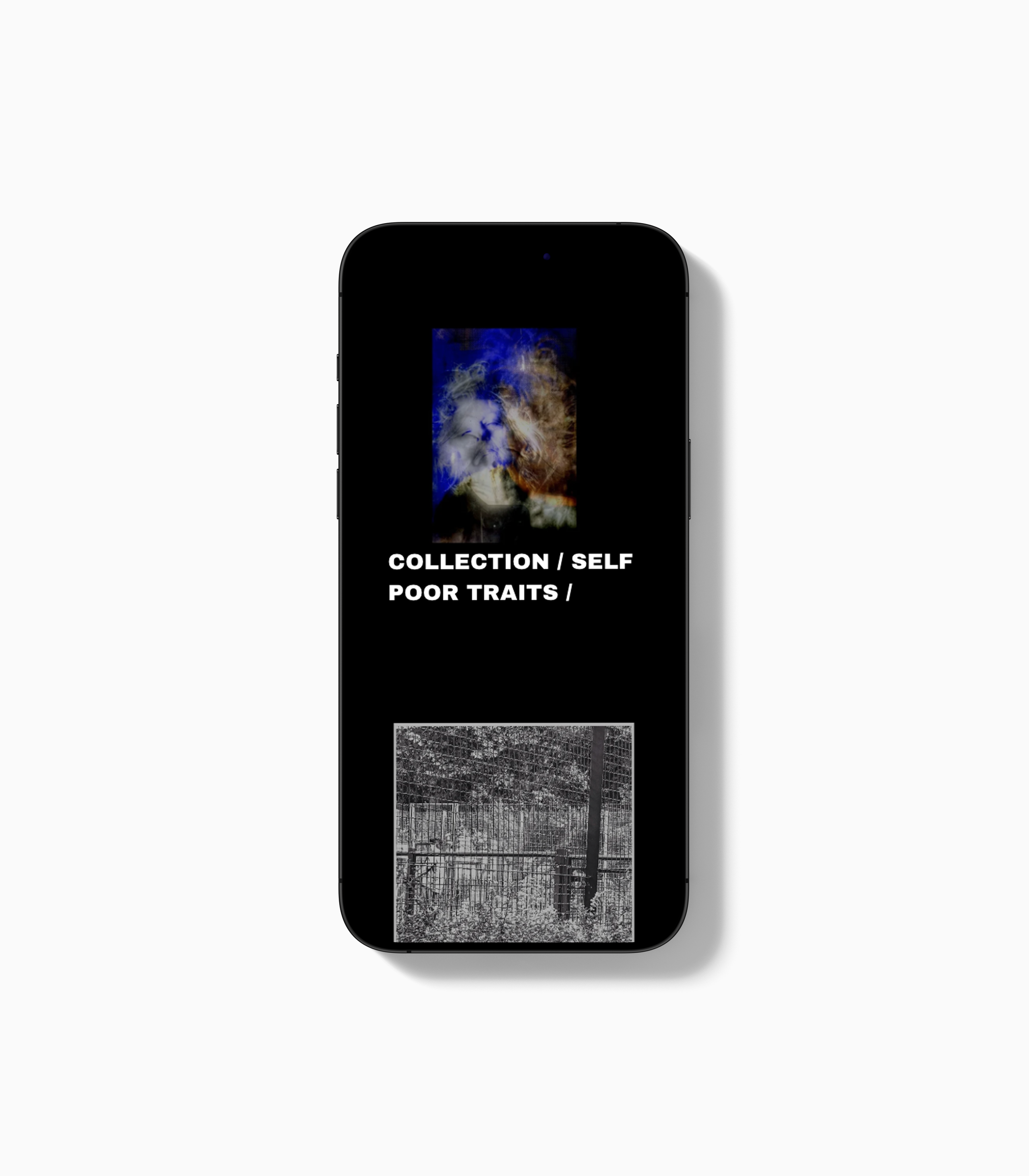
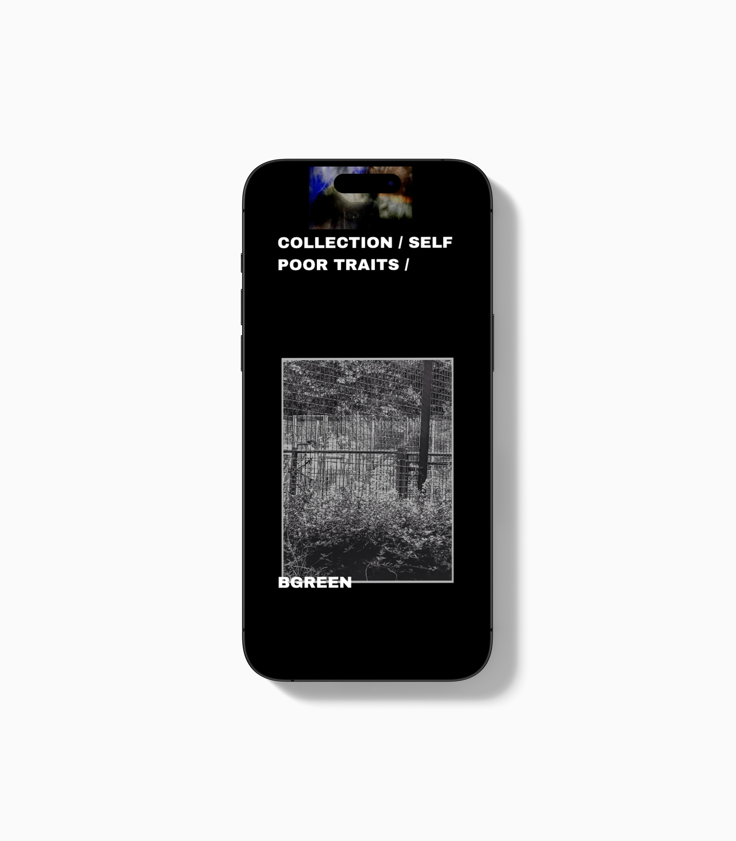
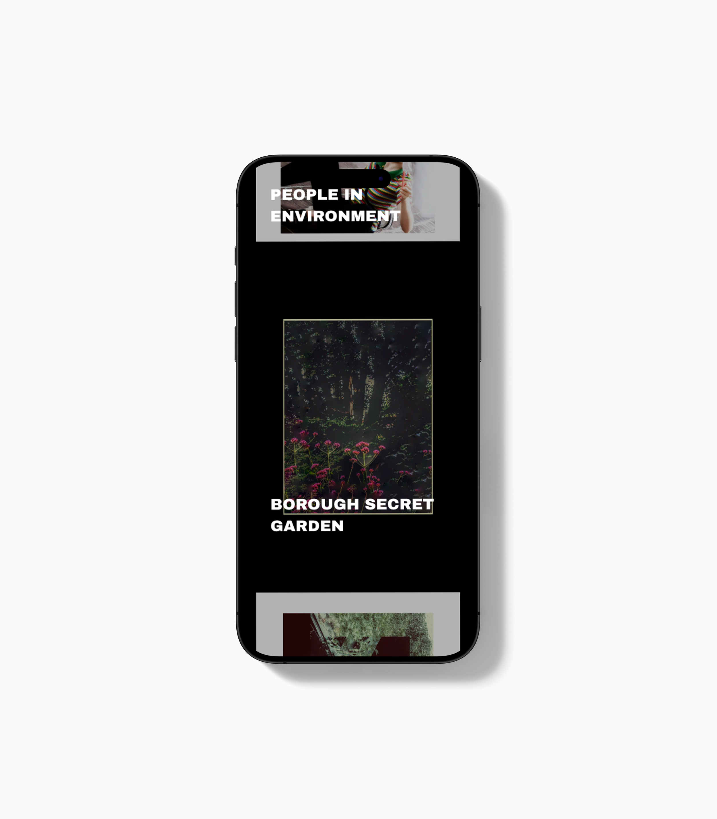
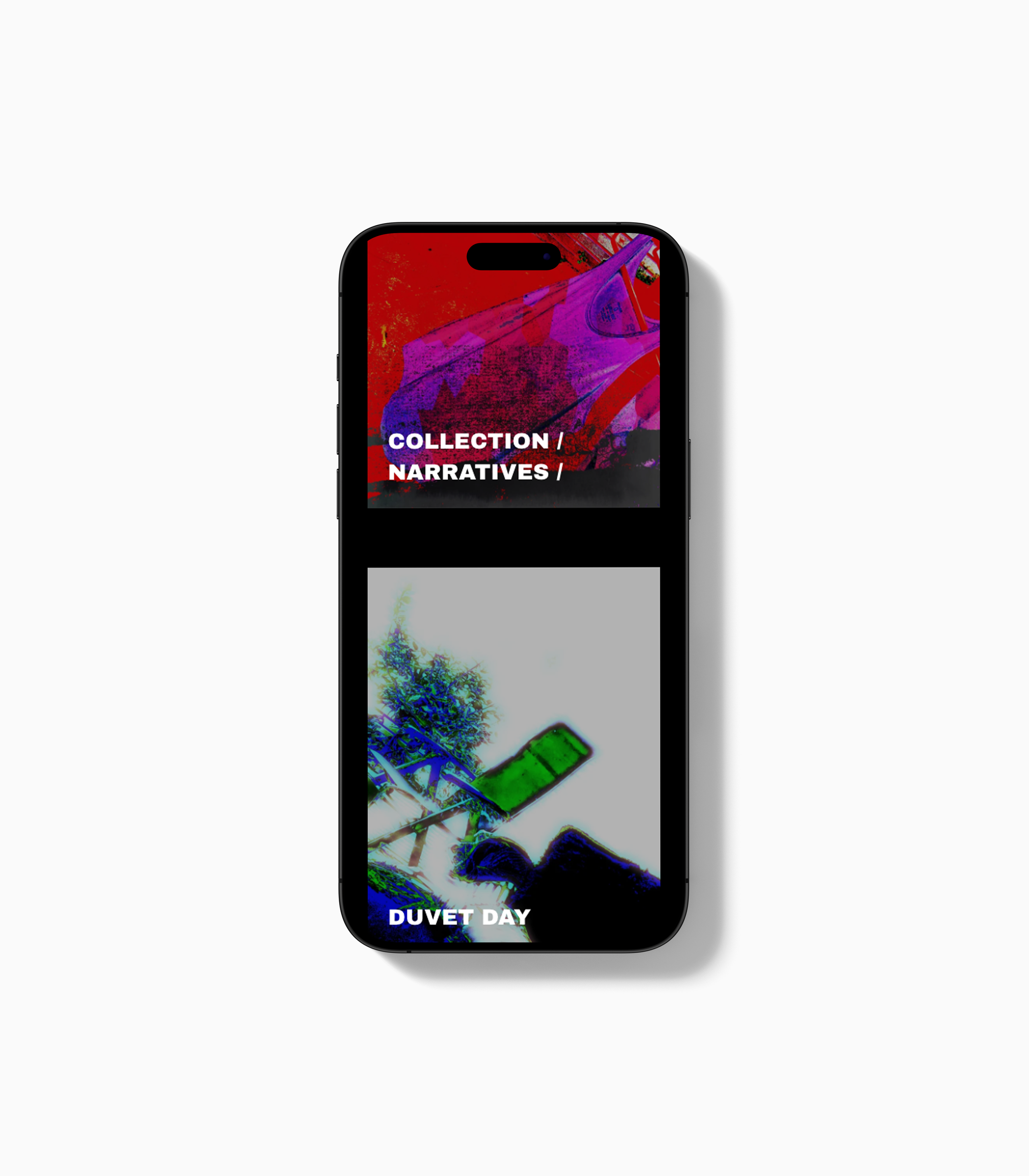
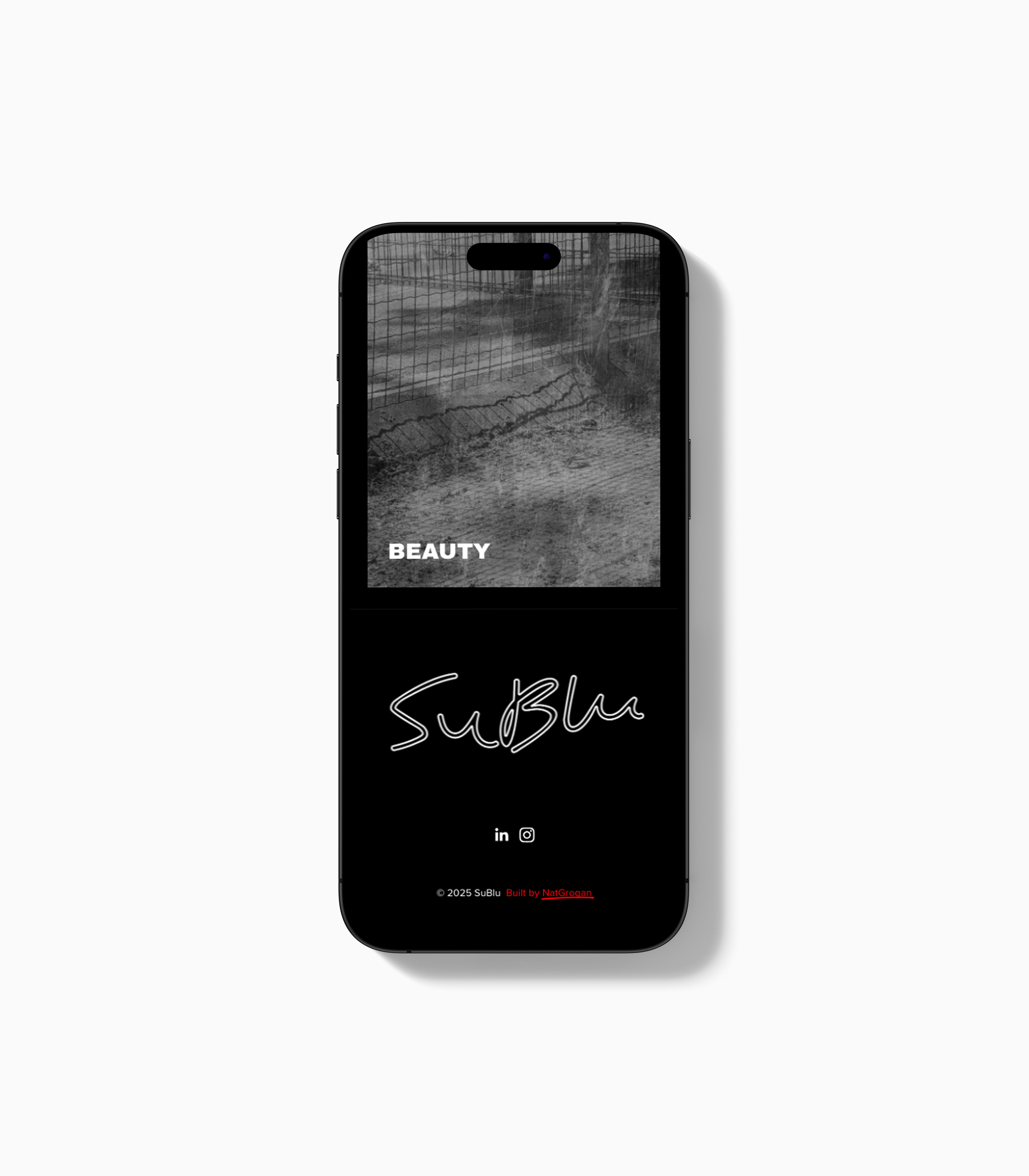
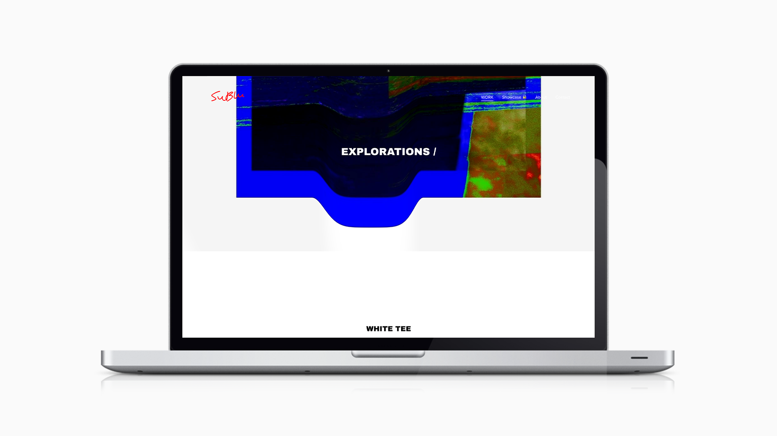
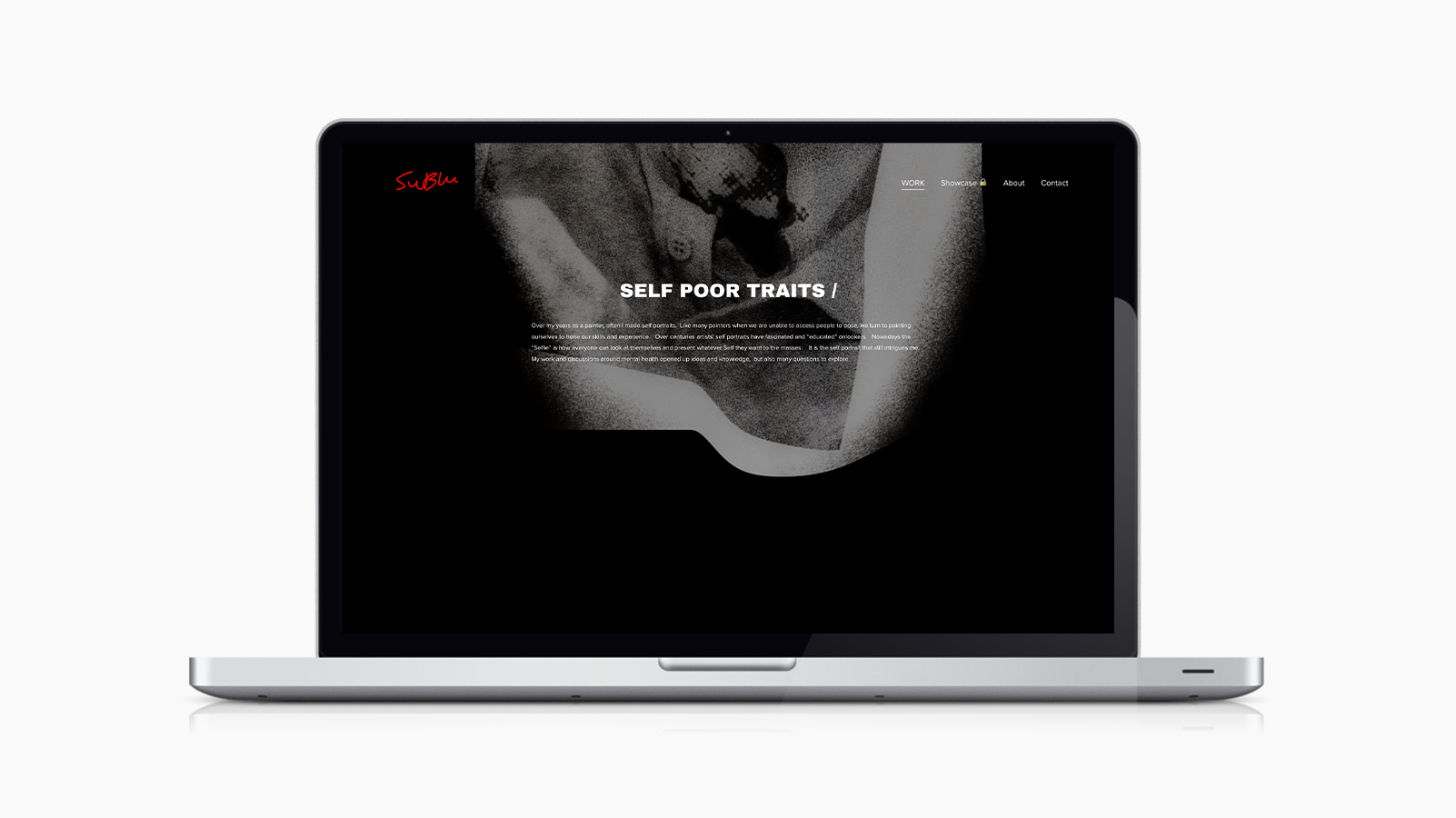
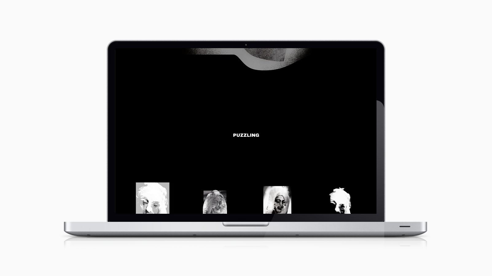
Typography, colour, and layout act as a quiet framework, intentionally restrained, acting more as a framework than a stylistic layer - creating consistency and clarity while maintaining focus on the content.
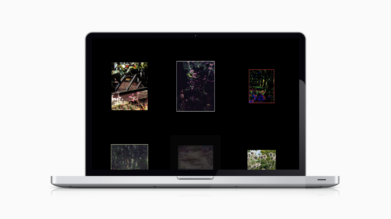
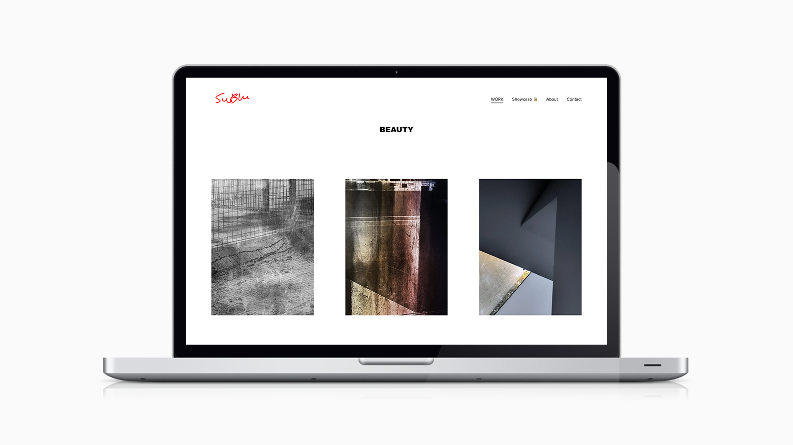
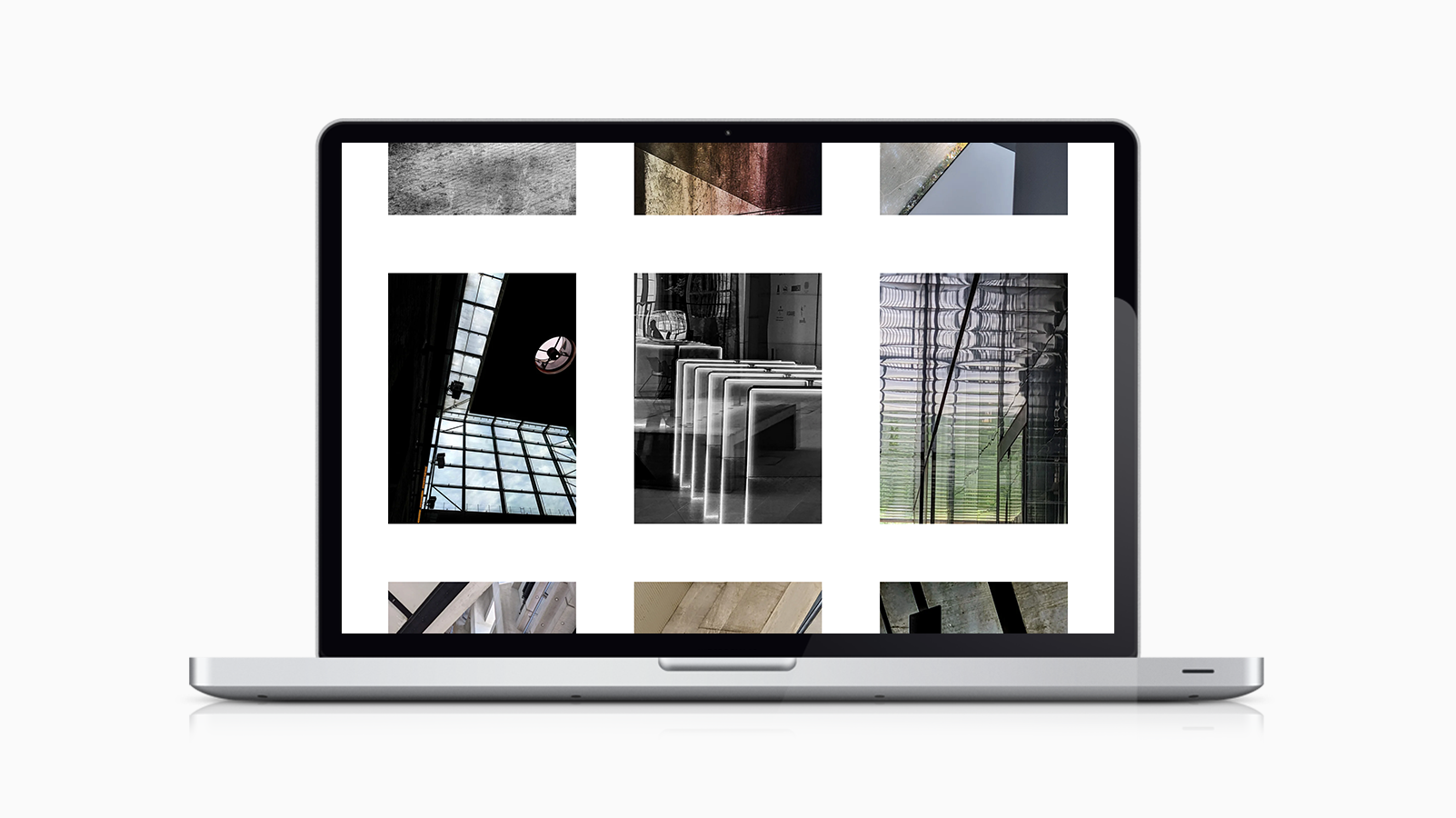
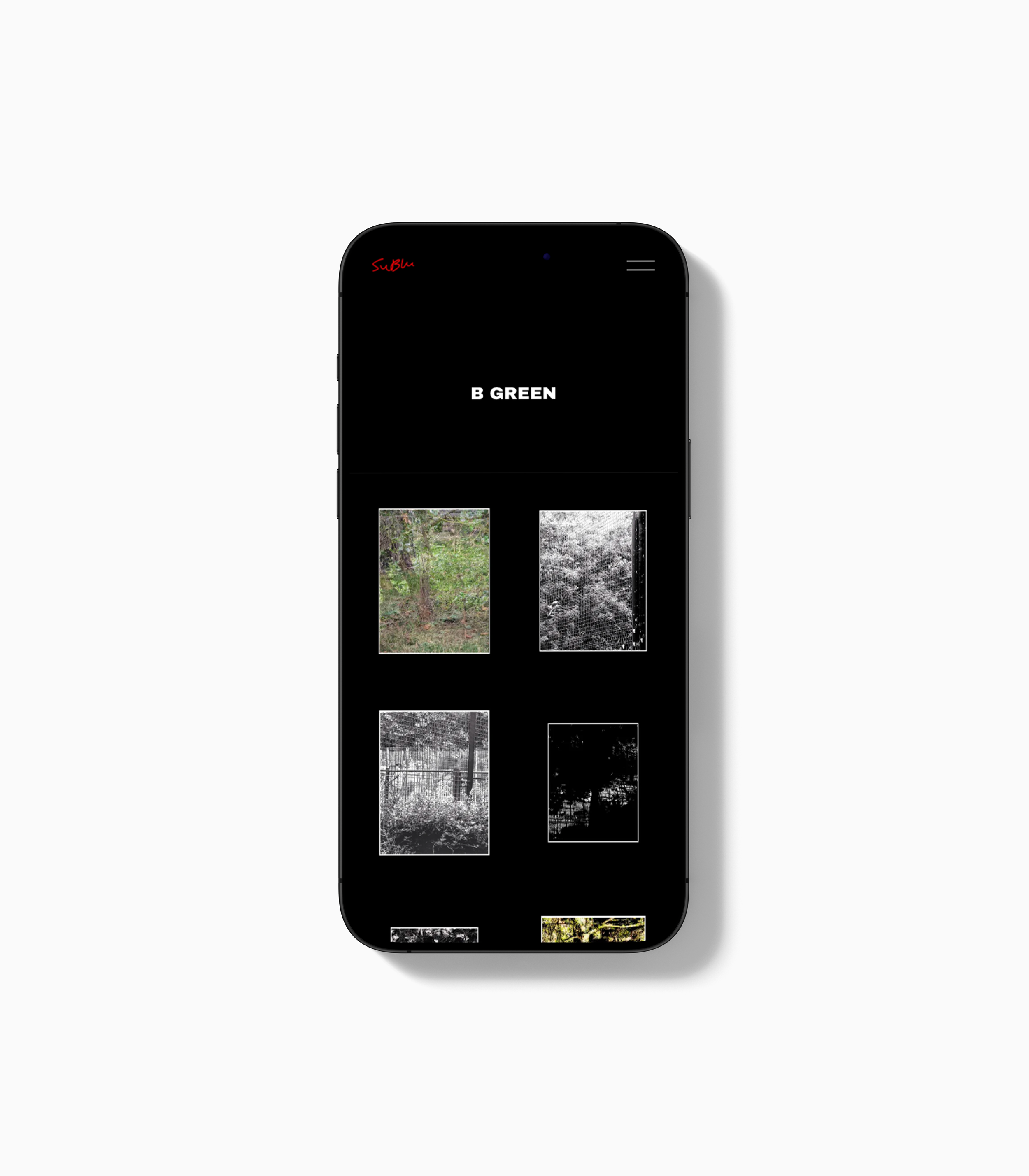
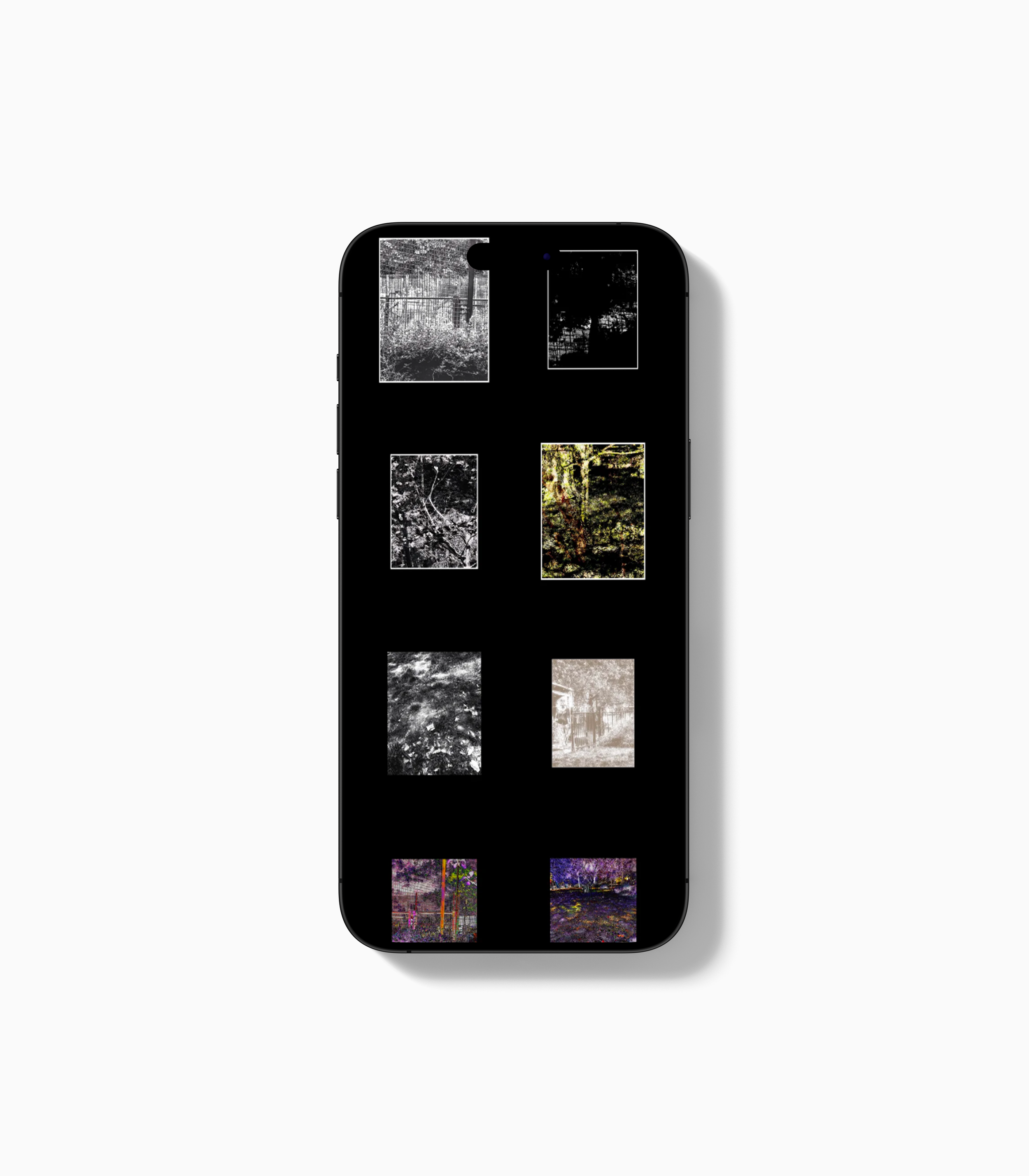
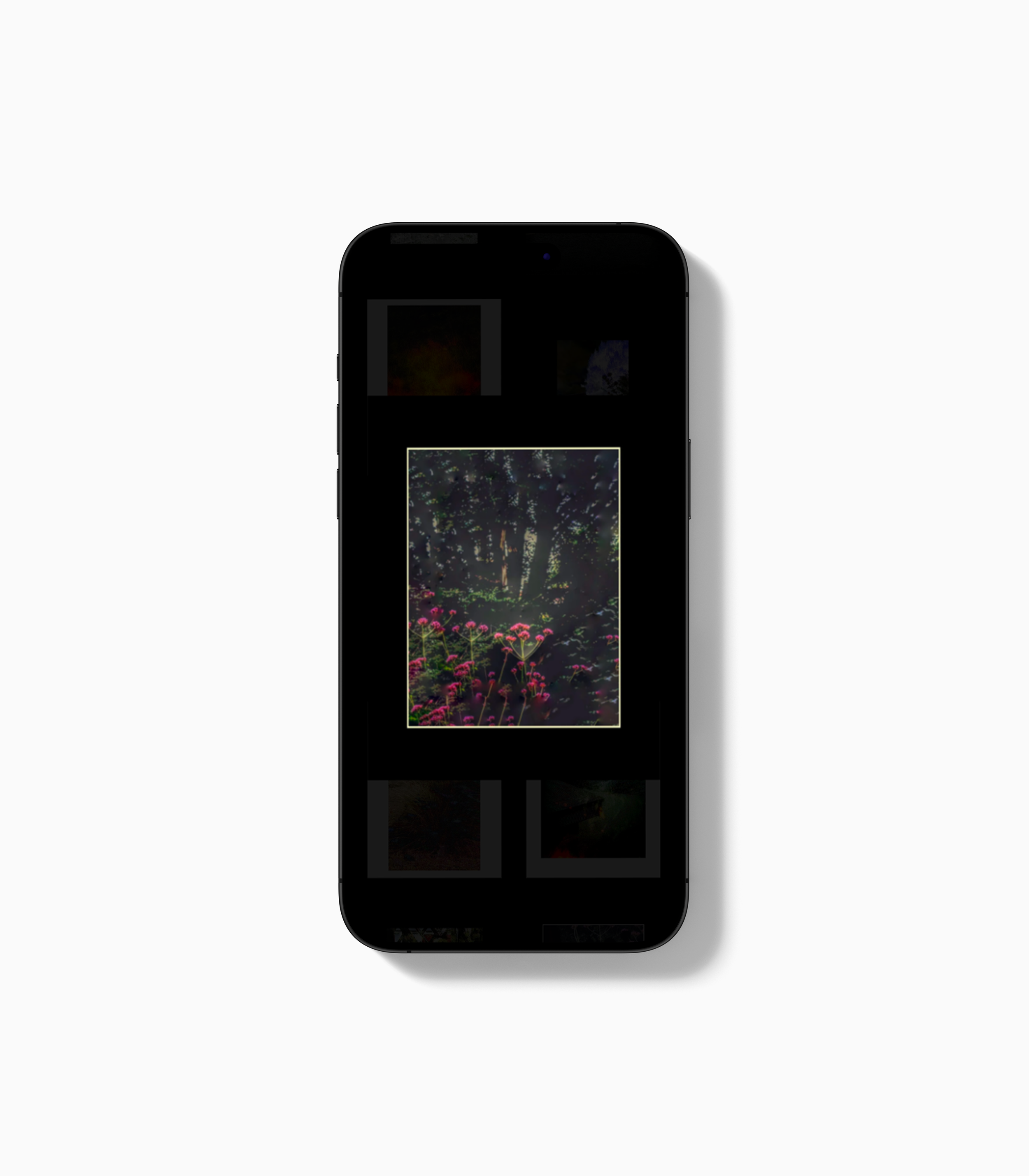
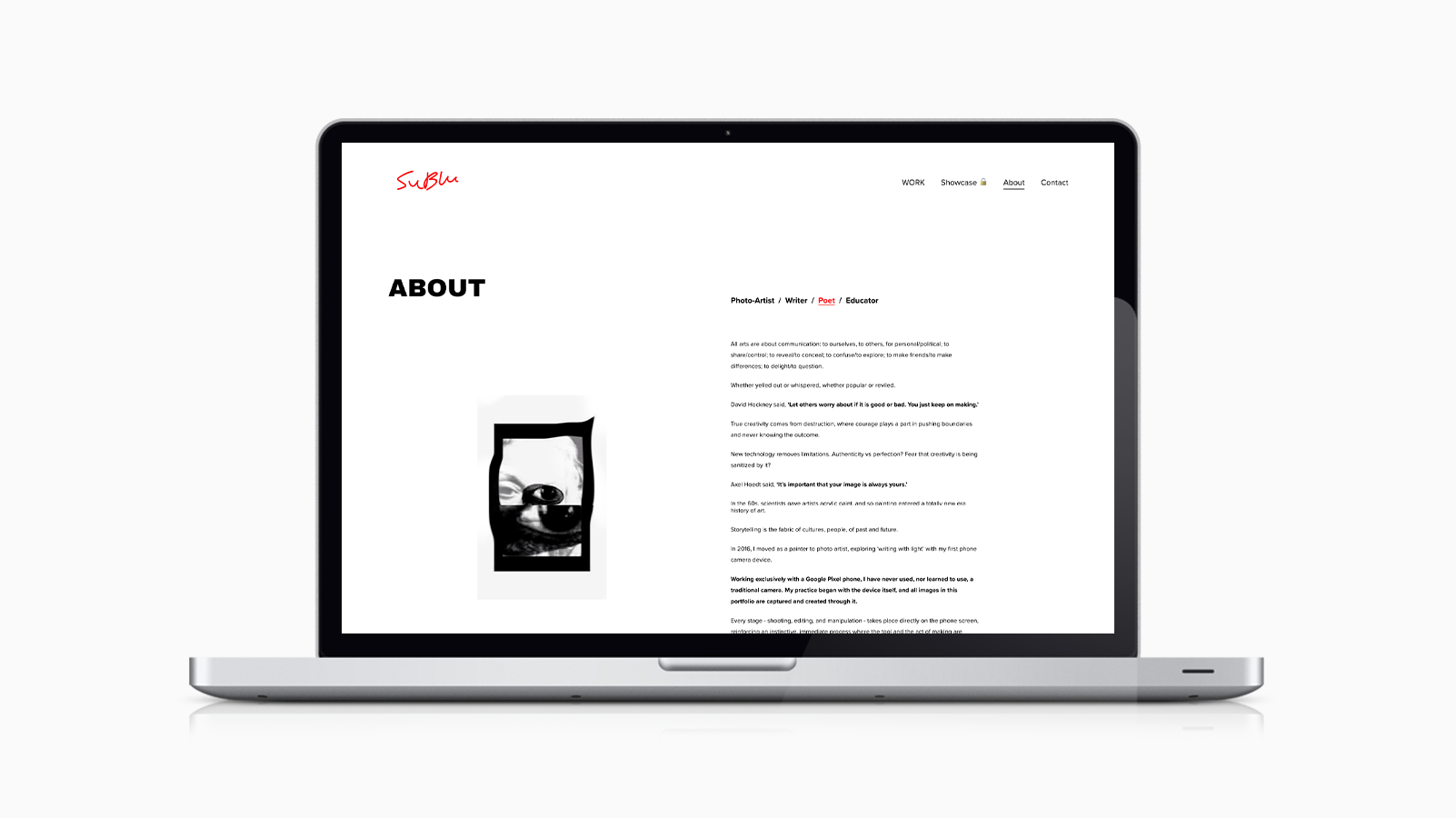

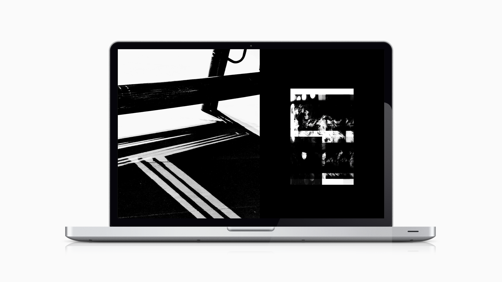
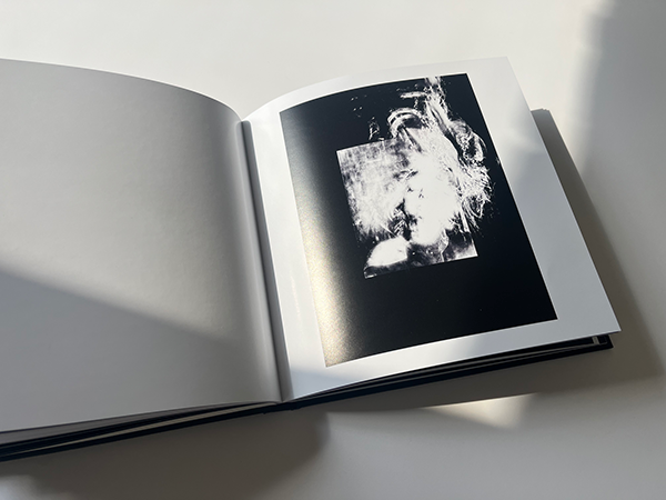
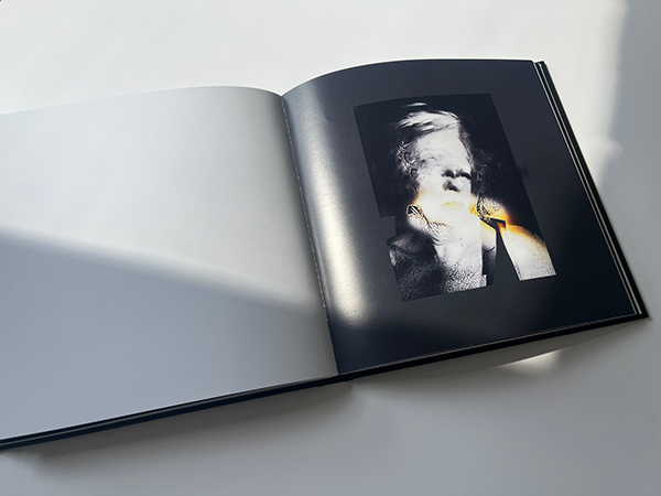
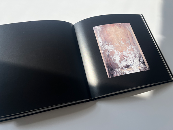
The system was extended across print, including a book (“HEADS”) and a set of business cards featuring a blood red seam, translating the identity into a more tactile, editorial format.
OUTCOME
The project transforms a fragmented archive into a structured, navigable platform.
The new system:
introduces clarity without over-explaining the work
organises the archive into coherent bodies of work
supports the artist’s voice without diluting it
creates a more accessible and considered viewing experience
The result is a platform that positions SuBlu’s work with greater intent and presence - making it more legible to audiences while remaining open-ended in interpretation.
DETAILS
Platform: Squarespace
Services: Identity Design, Digital Experience Design, Web Build, Print